Is your team spending more time compiling reports than acting on insights? Many companies face this exact problem. Data piles up from different sources, creating confusion and slowing down decisions.
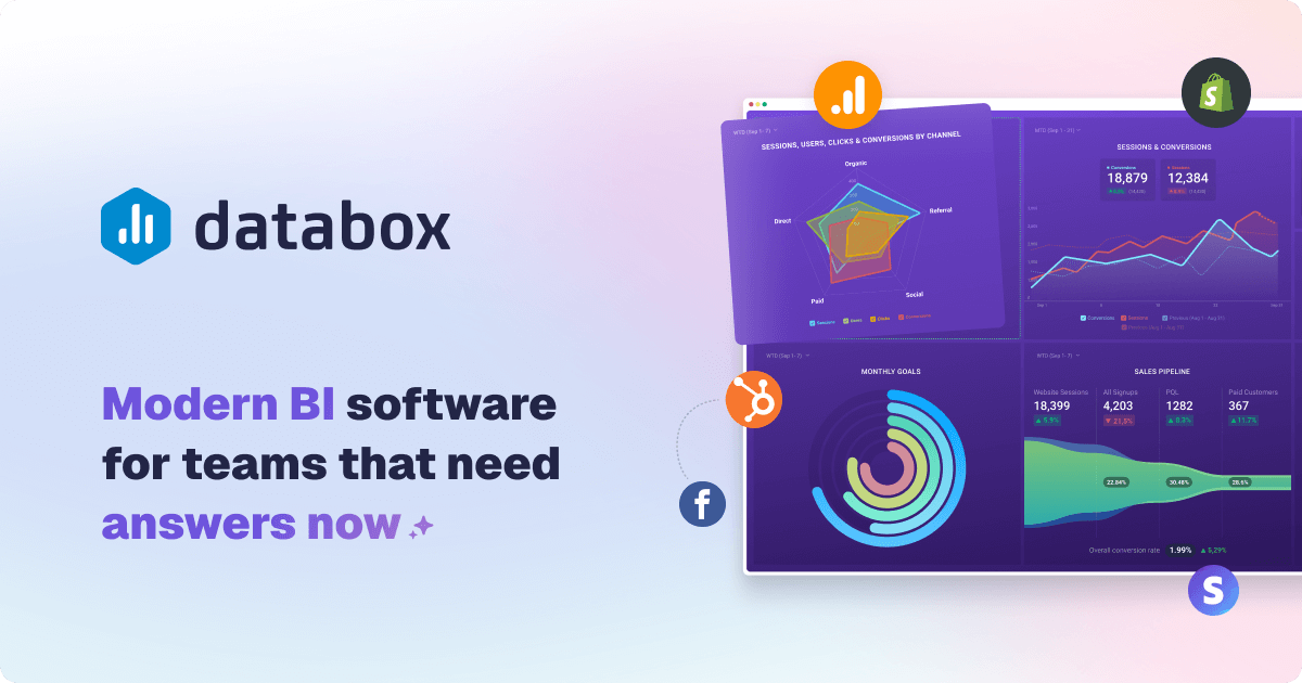
Modern business intelligence software changes this. A platform like Databox transforms raw numbers into clear visuals. It helps teams track key performance indicators in real time.
This solution unifies your data into a single dashboard. It ends debates over which numbers are correct. Your company can focus on goals and growth instead of manual reporting.
The platform is built for speed. Over 20,000 scaling teams use it to drive a 55% increase in sales. They also report cutting reporting cost in half and saving 60% of the time spent on reports.
This review provides the facts. We’ll examine features, pricing, and ease of use. You’ll learn if this tool fits your specific needs.
Key Takeaways
- Centralizes data from multiple sources into live, unified dashboards.
- Significantly reduces the time and cost associated with manual reporting processes.
- Designed for business analysts, executives, and team leaders to track KPIs and performance.
- Scalable for teams of all sizes with pricing based on data sources, not users.
- Claims to drive substantial improvements in sales performance and operational efficiency.
- Offers intuitive visualization to make complex metrics understandable at a glance.
- Aims for a shallow learning curve, enabling quick adoption across an organization.
Introduction: Transforming Data into Decisions
High per-user fees and long IT backlogs have made business intelligence inaccessible for most teams that need it. Traditional tools often require expensive per-seat licenses and complex ETL projects.
This creates data silos and delays critical performance updates. The reporting cycle becomes slow and costly.
Modern analytics software flips this model. It offers a self-service, no-code approach that empowers non-technical team members.
This concept is known as Do-It-Yourself Business Intelligence. It enables teams to build dashboards and reports in minutes, not weeks.
The shift is clear. Before, you faced custom code and SQL queries. After, you get unlimited users on every plan and go live fast.
You connect to over 130 integrations and choose from 200+ templates. This eliminates dependency on IT and reduces reporting cost significantly.
Having a single source of truth for your data is crucial. It aligns your entire team and improves decision-making speed.
Everyone works from the same unified metrics. This stops debates over which numbers are correct.
The platform follows a straightforward, six-step process. It starts with Connect and Prepare your sources.
Then you Visualize and Analyze the information. Finally, you Report & Automate and Plan for your goals.
Emphasis is on real-time data and automated reporting. This keeps leaders informed with prompt updates.
The solutions are flexible for different user roles. Analysts, executives, and functional leaders all benefit.
It applies across various industries. The following sections will delve deeper into each aspect of the platform.
This review provides the necessary information to evaluate your options objectively. We will answer your key questions.
What is Databox? A Modern BI Platform Overview
The journey from static dashboards to dynamic, self-service analytics represents a major shift in how companies use data. This platform is a comprehensive business intelligence solution designed for that new era.
It started as a dashboard tool and has evolved into a full DIY BI software. The core idea is to give teams powerful analytics without the typical complexity.
Modern BI differs from old legacy systems. It is cloud-based, user-friendly, and built to scale with your company.
You don’t need a big IT department to get started. The software handles the heavy lifting so your team can focus on insights.
From Dashboards to Full DIY Business Intelligence
The system is built around a complete process. It connects to your data sources, prepares the information, and turns it into clear visuals.
You can then analyze trends, share reports, and track goals. Everything works together in one unified platform.
A key recent feature is the Advanced Analytics release. It introduced Datasets for cleaning and merging raw data.
This update also added a no-code SQL builder and click-to-row drill-downs. These tools provide deeper analysis without technical skill.
CEO Pete Caputa stated this move “redefined what it means to be a self-service analytics platform.” He noted that teams now get BI-level power with Databox-level ease.
The philosophy is clear. Deliver advanced solutions without the high cost and steep learning curve of old enterprise tools.
The system pulls raw numbers from many sources. It transforms them into actionable metrics right inside the tool.
You won’t need separate ETL software. This saves significant time and reduces errors.
Building dashboards is intuitive. A drag-and-drop designer lets anyone arrange charts and graphs.
An extensive library of pre-built templates accelerates setup. You can go live in minutes, not weeks.
AI-powered insights automatically highlight trends and anomalies. Performance summaries help everyone understand the data quickly.
The tool also supports strategic planning. You can set goals, benchmark performance, and run forecasts.
All these features aim to make analytics accessible. Every team member can track KPIs and create custom metrics, regardless of their technical background.
This approach turns complex data into a clear path for business growth. It puts powerful reporting and visualization in the hands of the people who need it most.
Who is Databox Designed For?
Effective data visualization isn’t just for analysts; it’s for every decision-maker. The right analytics software adapts to different roles and their specific needs.
This platform serves a wide range of users within a company. From the technical expert to the busy executive, each person gets the tools they require.
Understanding these primary user personas shows the tool’s real-world value. It highlights how a single platform can unify an entire organization.
Business Analysts and Data Teams
For analysts, the core mission is to provide accurate, timely data. They often become bottlenecks when manual reporting consumes their day.
This software changes that dynamic. It lets analysts connect sources and build dashboards in minutes.
The drag-and-drop designer and pre-built templates accelerate the entire process. Analysts can ensure data accuracy while empowering other team members.
They remove themselves as a single point of failure. This frees up their time for deeper analysis and strategic work.
Executives and Company Leaders
Leaders need a high-level view of company performance. They require clarity, not complexity, to make swift decisions.
A unified executive dashboard provides this single source of truth. It pulls key metrics from every department into one place.
Real-time updates and automated alerts keep leaders informed without manual effort. They can track progress toward strategic goals at a glance.
This visibility stops debates over data and aligns the leadership team. It turns information into confident action.
Functional Team Leaders (Sales, Marketing, etc.)
Sales directors and marketing managers need to track their team‘s KPIs closely. Waiting for an analyst to build a report slows down their performance reviews.
The platform empowers these leaders directly. They can create custom metrics and build reports without technical support.
This self-service capability is powerful. A marketing leader can monitor campaign performance daily.
A sales manager can visualize pipeline health and customer acquisition cost. They own their data and can act on insights immediately.
Agencies and Marketing Consultants
For agency professionals, standardized reporting is a major feature. Managing multiple client accounts manually eats up valuable billable hours.
This tool offers dedicated client workspaces and white-labeling options. Agency teams can apply reusable templates across all their customers.
It creates a consistent, professional reporting experience. The system organizes data by client, campaign, or region using Spaces.
Providing clients with live, interactive dashboards improves transparency and retention. It turns a subscription cost into a value-added service.
Unlimited users on paid plans make it cost-effective for growing agency teams. Role-based permissions (Administrator, Editor, User, Viewer) manage access and security easily.
The platform is versatile by design. It serves individual contributors tracking project metrics and top management overseeing company-wide goals.
The shallow learning curve means people get up to speed quickly. In every case, the tool puts powerful visualization and actionable updates in the hands of the team that needs them.
Key Features and Capabilities of Databox
The true value of business intelligence lies in a seamless process that turns scattered numbers into clear, actionable plans. A robust platform connects every step, from raw information to strategic insight.
This workflow is built on six core components. Each one addresses a critical need in the analytics journey.
Connect: 130+ Integrations and Data Sources
Your data lives in many places. The first step is to bring it all into one unified view.
The software connects natively to over 130 popular business tools. This includes marketing, sales, finance, and support systems.
You can also pull data from Google Sheets, Excel files, and databases. This wide range of sources ensures nothing is left out.
One-click integrations make setup fast. Your team can start building a single source of truth in minutes.
Prepare: Datasets for Data Cleaning and Merging
Raw data often needs refinement before analysis. The Prepare stage handles this internally.
The feature is called Datasets. It lets you clean, filter, and standardize numbers directly on the platform.
You can merge information from multiple sources into a new, unified dataset. This enables deeper analysis without needing separate ETL software.
It saves significant time and reduces errors. Your team gets reliable, analysis-ready metrics.
Visualize: Drag-and-Drop Dashboard Designer
Turning numbers into clear pictures is crucial. The visualization tools are designed for speed and clarity.
An intuitive drag-and-drop designer lets anyone arrange charts and graphs. You choose from over 20 visualization types to best display your KPIs.
A library of 200+ pre-built templates accelerates creation. Find a layout for sales performance, marketing ROI, or customer service.
Dashboards are also viewable on TV displays and mobile devices. This allows for real-time monitoring and presentations anywhere.
Analyze: AI Insights and Drill-Down Analytics
Surface-level metrics only tell part of the story. Powerful analysis tools uncover the “why” behind the numbers.
You can drill down to row-level data with a click. Compare performance across different time periods easily.
Filter by any dimension to isolate specific trends. AI-powered insights automatically highlight significant anomalies and opportunities.
This moves you from simply observing data to truly understanding it. It empowers your people to create custom metrics and find root causes.
Report & Automate: Scheduled and Live Reports
Manual reporting consumes valuable hours every month. Automation reclaims that time for strategic work.
You can build Page Reports or Slide Reports for different audiences. Schedule them to run and deliver automatically.
Performance updates are sent directly to email, Slack, or mobile. You can also share a live link to an interactive dashboard.
This ensures stakeholders get the right report at the right time. It eliminates last-minute scrambling for updates.
Plan: Goal Tracking and Performance Benchmarks
Tracking data is pointless without context. The Plan feature ties your metrics to business goals.
Set and monitor targets for any KPI. Benchmark your current performance against past results or industry standards.
The system can even forecast future results based on historical data. This turns hindsight into foresight for better planning.
It closes the loop, connecting daily metrics to long-term company goals.
Together, these capabilities form a cohesive platform. The process from connection to planning happens in one place.
It is designed for a shallow learning curve, supporting the DIY BI philosophy. This empowers teams to make faster, data-driven decisions without technical bottlenecks.
Databox Pricing: A Detailed Breakdown of Plans
Choosing the right plan for your team involves balancing features, user count, and most critically, data connections. The pricing model is built around five distinct tiers.
Each subscription level offers different capabilities. Understanding these details is key to finding a cost-effective fit for your company.
Free Forever Plan: Limitations and Use Cases
The Free Forever tier costs $0 per month. It includes three data sources, three users, and daily data sync.
This plan is ideal for small teams or individuals who want to test the software. It answers basic questions about dashboard creation.
Use cases include personal performance tracking or a proof-of-concept for a small project. The daily sync means metrics update once per day.
Starter Plan: Entry-Level Analytics
Priced at $47 per month with annual billing, the Starter plan is an entry point. It supports five users and syncs data every four hours.
You still get three connected sources. This tier suits very small businesses needing basic reporting.
It’s a step up from the free version for more frequent updates. The user limit makes it less scalable for growing teams.
Professional Plan: The Core Offering for Teams
For $159 per month (annually), the Professional plan is the core offering. It provides unlimited users and hourly data sync.
This is where the platform becomes powerful for collaborative work. Entire departments can access live dashboards.

Advanced report features and more templates are unlocked here. It’s designed for teams that rely on shared KPIs.
The three included sources remain a key consideration. This plan delivers strong value for its subscription cost.
Growth Plan: AI and Predictive Features
The Growth tier costs $359 per month on an annual contract. It introduces AI-enhanced analytics and predictive insights.
You get all Professional features plus tools for performance management. This helps people create custom metrics and forecast trends.
Sync frequency stays at hourly. Unlimited users are standard, supporting company-wide visualization needs.
Premium Plan: Enterprise-Level Scale
At $799 per month (annual), the Premium plan is for enterprise level scale. It bundles 100 data sources, a massive jump.
Sync accelerates to 15-minute intervals for up to five key sources. You also gain access to 24/7 priority support.
This tier includes advanced security and options for custom integrations. It’s built for large customers with complex data ecosystems.
The Real Cost: Understanding Data Source Add-ons
The critical cost factor is additional data sources. Each extra connection costs $5.60 per month on annual plans.
This can significantly increase your total subscription price. A team with ten sources on the Professional plan pays much more.
Carefully calculate your required connections during the selection process. This avoids unexpected budget escalation.
Compared to legacy BI solutions, the platform can be more cost-effective. Unlimited users and lower entry prices are key advantages.
Agency professionals can get discounted per-source pricing. They also benefit from unlimited client workspaces.
Always consider annual billing for the best rates. This detailed breakdown helps you align the software with your financial goals.
Ease of Use and Learning Curve
A shallow learning curve is essential for widespread adoption of data tools across a company. The platform’s design philosophy centers on getting teams from setup to insight with minimal friction.
This focus on usability determines how quickly your people can track KPIs and act on them.
Initial Setup and “Go-Live” Speed
Databox promotes a fast start, claiming users can build a first dashboard in under five minutes. This promise hinges on one-click integrations and pre-built templates.
Most teams achieve a share-ready view within 5 to 15 minutes. Connecting your primary data sources is a straightforward process.
The initial speed reduces barriers to entry. It allows you to validate the tool’s value for your specific needs without a long commitment.
The Drag-and-Drop Interface and Template Library
The core editor uses a drag-and-drop designer. Users can add, resize, and customize visualizations without writing code.
An extensive library of over 200 pre-built templates accelerates creation. You find layouts for Google Ads, Shopify analytics, executive KPIs, and more.
All dashboards, reports, goals, and alerts are accessible from a single sidebar. This unified environment reduces context switching and saves time.
The interface is intuitive for standard reporting tasks. Non-technical team members can perform their own analysis after a brief orientation.
Where Users Hit the Learning Curve
The learning curve becomes noticeable with advanced customizations. Attempting complex layouts or adjusting grid controls can require more effort.
Some functions are tucked into nested menus. Discovering these options takes exploration.
A key feature for agency work is cloning dashboards for multiple clients. While straightforward, there is no master template system.
Updates must be made manually to each clone. This contrasts with some competitors that offer linked templates for easier bulk edits.
Creating custom metrics and formulas also presents a steeper climb. The software is designed for self-service, but mastering its full power demands investment.
Overall, the platform is user-friendly for standard reporting. Teams should plan for additional learning time to leverage its more advanced capabilities.
Integration Breadth and Connection Reliability
Your dashboards are only as good as the connections feeding them fresh, accurate data. A platform’s integration network and pipeline stability are critical for trust.
Teams rely on these links for real-time performance updates. Any break can disrupt entire reporting workflows.
Native Integrations vs. Custom API Connections
The software offers over 120 one-click native connectors. These cover popular tools like Google Analytics 4, HubSpot, Shopify, and Meta Ads.
You also find sources for Stripe, Xero, and many sales platforms. This breadth helps teams unify metrics quickly.
For custom data sources, options include REST API, Push API, and Google Sheets. CSV or Excel file uploads are also supported.
Building a custom API connection may require developer resources. Some users note the Python SDK has installation questions.
Documentation for these advanced methods is often described as bare-bones. Limited community support can slow the implementation process.
Common User Complaints: Broken Metrics and Sync Issues
The public Status Page shows impressive claimed reliability. It lists 100% connector uptime and 99.98% web-app uptime over 90 days.
User experiences sometimes tell a different story. A frequent complaint involves “re-authentication needed” pop-ups.
Platforms like Meta Ads may require frequent re-auth. This leads to blank charts and missing data in dashboards.
When a connector breaks, all dependent metrics and templates can fail. Repairing them requires manual work and time.
One user, Guy M., reported broken metrics for weeks. He cited slow fixes from the support team as a major frustration.
In a severe case, the platform was reportedly down for nearly three weeks. This can cripple client reporting for agency professionals.
The system provides alerts for API changes and manual refresh options. Some customers still find reliability inconsistent versus competitors.
For mission-critical reports, this instability poses a real risk. It contrasts with tools offering more robust connector maintenance.
Integration breadth is a clear strength. Connection reliability, however, remains a noted concern for some teams.
Data Blending, Custom Metrics, and Limitations
The ability to blend data and create custom metrics separates basic dashboards from true analytical tools. For teams that need deeper insights, these features are critical.
They allow you to move beyond standard reports and answer complex business questions. Understanding their scope and constraints is key for evaluating any analytics platform.
Creating Calculated Metrics and Formulas
The Metric Builder is the core tool for this task. It lets you build formulas using arithmetic operations across different data sources.
For example, you can calculate Customer Acquisition Cost by dividing Ad Spend from Facebook by New Customers from your CRM. This turns raw numbers into actionable business metrics.
The process is designed for self-service. Team members can define their own KPIs without waiting for technical support.
This empowers people to track performance in ways that match their specific goals. It’s a powerful feature for basic to intermediate analysis needs.
The One-Dimension Limitation in Custom Metrics
A significant constraint exists for most data sources. You can typically only select one dimension per custom metric.
This means you might create “Sessions by Campaign” or “Sessions by Country” as separate calculations. You cannot easily combine both dimensions in a single metric.
Google sources like Analytics 4 are a notable exception. They allow multiple dimensions, but this inconsistency can be frustrating for users.
A common workaround is duplicating metrics and swapping the dimension. This becomes tedious and time-consuming when managing many data slices.
It adds unnecessary work to the reporting process. For teams needing multi-dimensional analysis, this limitation is a notable hurdle.
Data Blending Capabilities vs. Advanced Needs
Data blending via Calculated Metrics allows aggregation from multiple platforms. You can sum “Total Ad Spend” from Facebook and Google Ads, for instance.
However, this blending does not support true relational joins on shared dimensions like Campaign Name. You cannot seamlessly merge two datasets on a common key for row-by-row analysis.
Advanced business intelligence tools support full outer joins on dates or IDs. This enables more complex modeling and deeper insights.
Some user reviews note inaccuracies in simple calculations. These issues can lead to distrust in the data presented on dashboards.
The software offers Datasets for internal data preparation and merging. Yet, users with advanced data modeling needs may find it insufficient.
Competitors often offer unlimited custom dimensions and true blending across all plans. This platform is sufficient for basic and intermediate use.
For complex analytical requirements, its data manipulation features may fall short. Teams should evaluate their specific needs against these capabilities.
Reporting and Dashboard Flexibility
Flexible reporting options determine whether your data insights remain static documents or become dynamic tools for decision-making. The right platform offers both polished presentation and deep interactivity to serve different team needs.
This balance is crucial for communicating performance effectively. Leaders may want a snapshot, while analysts require the ability to drill down.
Pre-Built Templates and Customization
Hundreds of pre-built dashboard and slide-style report templates are available. They cover various industries and functions like sales, marketing, and e-commerce.
These templates let users launch professional-looking dashboards in minutes. They provide a strong starting point, saving many hours of design work.
Customization options include color schemes, chart types, and branding elements. You can adjust these to match your company identity.
Layout flexibility, however, is limited to a fixed grid system. This ensures consistency but may restrict highly unique designs.
The variety helps teams answer common business questions quickly. It accelerates the entire reporting process from data to delivery.
Static Reports vs. Live, Interactive Dashboards
A key distinction exists between static outputs and live views. Static reports are exported as PDFs or presentation slides.
They are perfect for formal presentations or archival purposes. These documents capture a moment in time.
Live, interactive dashboards update in real-time with fresh data. They allow stakeholders to explore the information dynamically.
Clicking on any number reveals a detail panel with row-level data. Users can pivot by dimensions and apply real-time filters.
This interactivity transforms a report from a passive document into an active analysis tool. It empowers people to investigate the “why” behind the metrics.
Live dashboards can also be embedded into websites or member portals. This provides clients with always-updated views without login barriers.
The Master Template Challenge for Agencies
For agency professionals managing multiple client accounts, a specific challenge arises. The software allows dashboards to be cloned for different customers.
However, there is no true master template system linking these copies. Each cloned dashboard becomes an independent entity.
If you need to update a chart or add a new metric, you must manually edit every single client dashboard. This process is repetitive and time-consuming.
It contrasts with tools that offer linked templates. In those systems, an edit to a master template propagates automatically to all linked reports.
User reviews often praise the polished look of the reports. Yet, many criticize the manual effort required for bulk updates across many accounts.
This can become a significant burden as an agency scales. The cost in billable hours for maintenance can escalate.
The platform does offer “Scorecards” for single-metric views and mobile-friendly designs. These features add to reporting flexibility for specific use cases.
For one-off or small-scale reporting, the system is a strength. It produces beautiful, interactive visualization quickly.
For agency teams managing dozens of similar client dashboards, the lack of a master template can be a major drawback. It adds ongoing work to their subscription.
Collaboration and Team Management Features
Managing team access and organizing data effectively are foundational to any successful analytics deployment. A platform’s collaboration tools determine how easily insights spread across your organization.
Strong features here eliminate bottlenecks and silos. They ensure the right people see the right metrics at the right time.
This fosters a unified, data-driven culture. Everyone works from the same source of truth.
Unlimited Users and Role-Based Permissions
All paid plans include unlimited users. This is a major advantage over legacy business intelligence tools.
Old systems often charge per seat, limiting access to a select few. That restriction hurts adoption and slows decision-making.
Unlimited users encourage widespread use across departments. Your entire company can track KPIs without worrying about license cost.
To control access, the software offers four role-based permission levels. Administrators have full control over settings and data sources.
Editors can build and modify dashboards and reports. Users can view and interact with all content but cannot edit.
Viewers have read-only access to shared items. This granular system protects sensitive information while promoting transparency.
Careful permission management is necessary. It prevents unauthorized data access while empowering team members.
Organizing with Spaces for Teams and Clients
The concept of Spaces is a powerful organizational feature. These are dedicated workspaces that group related dashboards, reports, and metrics.
You can create a Space for each department, project, campaign, or client. This keeps everyone focused on their relevant performance data.
It removes clutter from other departments. A marketing team sees only their campaigns and results.
The sales department monitors their pipeline in a separate Space. This organization streamlines the work process for all involved.
For agency professionals, Spaces are invaluable. You can create a dedicated Space for each customer.
This streamlines client management and reporting. All metrics and visualization for one account live in one place.
It saves significant billable hours on recurring report creation. You can apply reusable templates across multiple Spaces.
Additional collaboration tools enhance teamwork. Users can leave in-context notes directly on a dashboard.
This allows for discussion about specific updates or anomalies. Automated Slack updates can be configured for key metrics.
These alerts keep the team informed in real-time. They eliminate the need for manual status updates every day.
The combination of unlimited users and Spaces makes the platform highly scalable. It grows with your organization and adapts to multi-client environments.
New people can be onboarded in minutes. They get immediate access to the data they need.
This supports a shallow learning curve for new team members. They can start answering business questions quickly.
In any case, these collaboration features are robust. They are designed to support teamwork across distributed organizations.
The system empowers people to create custom metrics and share insights seamlessly. This turns individual data points into collective intelligence.
Customer Support: A Mixed Bag of Reviews
User experiences with technical and billing assistance reveal a stark divide between satisfaction and frustration. The quality of help you receive seems to depend heavily on your plan tier and the nature of your issue.
This inconsistency makes customer support one of the most polarizing aspects of the platform. Some teams praise it, while others feel completely abandoned.
Praise for Helpful and Knowledgeable Agents
Many positive reviews highlight friendly and professional agents. These support staff are often praised for their deep knowledge of the software.
They can quickly diagnose problems with data connections or dashboard configurations. This effective help resolves team blockers and keeps reporting workflows on track.
For common questions, an AI chatbot is available 24/7. It reportedly resolves over half of user queries with high satisfaction, reducing wait time.
Human chat support is also offered for over 13 hours on weekdays. Email is an option for less urgent questions.
Criticism Over Slow Response Times and Unresolved Issues
Negative experiences tell a different story. A frequent complaint involves slow response time, often exceeding 24 hours.
Some users report sending urgent queries only to face radio silence for days. Technical issues, like broken metrics or sync failures, can remain unresolved for weeks.
One user, Alan M., noted a clear decline in support quality over time. Others describe interactions where agents became defensive instead of helpful.
Billing disputes and refund requests are particularly problematic areas. Customers report difficulty getting clear answers or resolutions on subscription cost issues.
AI Chatbot and Tiered Support Resources
The experience improves significantly for Premium plan subscribers. They receive priority support, a named success engineer, and a dedicated analyst.
This tiered system means clients on lower-cost plans may have a very different experience. Competitors sometimes offer dedicated customer success managers on all plans.
Potential customers should consider their support needs carefully. If reliable, fast help is critical, a higher-tier plan may be necessary.
In the end, customer support for this tool is a story of two extremes. Your experience will likely fall into either the “excellent” or “frustrating” category, with little middle ground.
The Pros: What Users Love About Databox
When a business intelligence tool delivers on its promise, users become its strongest advocates. Positive feedback from satisfied teams highlights the platform’s core strengths. These advantages turn chaotic data into a streamlined process for decision-making.
Users consistently report several key benefits. These pros make the software a compelling choice for businesses seeking accessible analytics.
Rapid Setup and Intuitive Visualization
Teams love how quickly they can get a live dashboard running. Many report going from zero to a shareable view in under an hour. This speed comes from one-click integrations and a vast library of pre-built templates.
The drag-and-drop designer requires no coding skills. Anyone can arrange charts and graphs to tell a clear story. This intuitive approach makes data easy to understand for non-technical audiences.
Visuals are clean and professional right from the start. This eliminates the need for lengthy design work. Your team can focus on insights instead of formatting.
Unified Data from Multiple Sources in One Place
A major pain point for companies is data living in separate silos. This platform solves that by pulling information from over 130 different sources. Everything appears in a single, unified dashboard.
Marketing, sales, finance, and support metrics come together. This creates a “single pane of glass” for the entire company. It ends debates over which numbers are correct.
Having one reliable source of truth aligns teams. Everyone works from the same set of metrics. This clarity speeds up strategic discussions and planning.
Time Savings on Report Creation and Automation
Manual reporting consumes valuable hours every week. Automation through this tool reclaims that time for strategic work. Users schedule reports to run and deliver themselves.
Reusable templates save enormous effort for recurring updates. One long-term user reported saving “thousands of hours” over the years. This efficiency is a game-changer for busy professionals.
For agency teams, the time savings translate directly into billable hours. Automated client reporting improves transparency and satisfaction. It turns a subscription cost into a value-added service.
Additional features receive strong praise. AI-powered insights automatically highlight trends and anomalies. Drill-down capabilities help users understand performance drivers quickly.
The unlimited users policy on paid plans is another major advantage. Entire departments can access live dashboards without extra costs. This encourages a data-driven culture across the organization.
Users also appreciate the platform’s commitment to continuous improvement. A transparent roadmap shows where the software is heading. These pros combine to offer an efficient and accessible business intelligence solution.
The Cons: Where Databox Falls Short for Some
Understanding the limitations is just as important as recognizing the strengths when selecting a business intelligence tool. User feedback highlights several areas where the experience can fall short of expectations.
These drawbacks range from financial surprises to technical frustrations. They are significant enough that some teams have switched to alternative platforms.
Cost Can Escalate Quickly with Added Data Sources
The advertised monthly subscription cost is just the starting point. Each extra data source beyond your plan’s limit adds $5.60 per month.
This pricing model can balloon bills unexpectedly. A team connecting ten sources on a Professional plan sees a much higher total cost.
Careful calculation of required connections is essential during the selection process. It prevents budget escalation that impacts your company‘s financial goals.
Inconsistencies in Connector Stability and Data Accuracy
Reliable data feeds are the foundation of any dashboard. Users frequently report broken metrics and sync issues.
Connectors for platforms like Meta Ads may require frequent re-authentication. This leads to blank charts and missing information in reports.
When a source breaks, all dependent templates and visualization can fail. Repairing them demands manual work and valuable time.
Some users also question data accuracy. Simple calculations sometimes produce incorrect results.
This forces people to manually verify numbers. It undermines trust in the entire reporting system.
One user, Guy M., described customer support tickets for broken templates that remained unresolved for years. Such cases highlight a serious reliability gap.
Customer Support Experiences Can Vary Widely
The quality of help you receive seems tied to your plan level. Premium customers get priority support and dedicated contacts.
Users on lower-tier plans often face a different reality. Complaints include slow response time, often exceeding 24 hours.
Technical issues can linger for weeks without resolution. Billing disputes and refund questions are particularly problematic areas.
Some clients report agents becoming defensive instead of helpful. This variability makes support a polarizing aspect of the platform.
Additional frustrations impact specific user groups. Agency professionals face a major workflow hurdle.
The software lacks a true master template system. Updating a chart or metric requires manually editing every single client dashboard.
This repetitive process consumes billable hours as an agency scales. It adds significant ongoing work to their subscription.
Analysts encounter limitations when they try to create custom metrics. For most sources, you can only select one dimension per calculation.
This “one-dimension limitation” hinders complex analysis. It forces tedious workarounds to view data sliced different ways.
The learning curve for these advanced features is also steeper. Users expecting complete simplicity can find this frustrating.
Contrast this with some competitors. Other tools offer more stable connectors, consistent support on all plans, and more flexible pricing.
These cons are substantial. They emphasize the need for a careful evaluation against your specific performance tracking needs.
Databox for Agencies and Consultants: A Specialized Fit
Agency professionals face a unique challenge. They need to provide consistent, branded reporting across dozens of client accounts efficiently.
The right analytics platform transforms this complex task into a streamlined operation. It turns a time-consuming service into a scalable competitive advantage.
Specialized features cater directly to multi-client environments. These tools help agencies deliver exceptional value while protecting their billable hours.
Client Workspaces and White-Labeling Options
The software provides unlimited dedicated client workspaces within a single portal. This is a foundational feature for any growing agency.
Each workspace, called a Space, groups all relevant dashboards, metrics, and reports for one customer. It keeps everything organized and accessible.
White-labeling options allow full branding customization. You can apply your agency’s logo, colors, and domain to every shared dashboard.
This creates a seamless, professional experience for your clients. It reinforces your brand as the source of valuable insights.
The platform supports role-based permissions for secure access. You control exactly what each client or team member can see.
Saving Billable Hours on Recurring Reporting
Manual report creation is a major drain on agency resources. Automating this process reclaims those hours for strategic work.
One marketing strategist reported saving “at least two hours a month per client.” This adds up to significant time savings across an entire portfolio.
Reusable, branded templates are key to this efficiency. You can build a master report layout once and adapt it quickly for new customers.
Automated scheduling sends reports directly to client email or Slack. You can also share a live link to an interactive dashboard.
An agency dashboard overview provides a high-level view of all accounts. This helps managers instantly identify which clients need attention.
It streamlines the internal review process. Your team can focus on performance analysis instead of data compilation.
Potential Pitfalls for Multi-Client Environments
Despite its strengths, agencies must navigate certain limitations. Awareness of these pitfalls is crucial for success.
Connector instability can lead to broken metrics in client reports. When a data source fails, it affects all dependent dashboards across workspaces.
This damages client trust and requires manual repair work. Agencies must monitor connections closely to prevent this issue.
A significant workflow hurdle is the lack of a true master template system. If you update a chart, you must manually edit every single client dashboard.
This repetitive process consumes billable hours as an agency scales. It adds ongoing maintenance work to the subscription cost.
Pricing can escalate with many data sources per client. While discounted per-source pricing is available for agencies, bills can grow quickly.
Careful planning of required connections is essential. It prevents unexpected budget strain.
Many agencies still find the platform a powerful tool. Positive testimonials praise it for improving client retention and operational efficiency.
In conclusion, this software can be an excellent fit for consultancies. They must be prepared to manage its limitations and ensure reliable data connections.
The specialized features offer clear value for multi-client reporting. When implemented thoughtfully, it becomes a cornerstone of an agency’s service delivery.
Security, Compliance, and Platform Reliability
Before teams can act on insights, they must trust that their metrics are stored securely and accessible without interruption. A platform’s foundation in these areas determines its suitability for sensitive business data.
Enterprise-grade controls and transparent operations are essential. They ensure your reporting process remains uninterrupted and your information stays protected.
Data Encryption and Certifications
The software runs on Amazon Web Services infrastructure. This provides a robust security baseline from the start.
Data encryption uses AES-256 for information at rest. TLS secures all data in transit between your sources and the platform.
Additional measures include VPC isolation and 24/7 monitoring. Quarterly penetration testing helps identify and address potential vulnerabilities proactively.
For compliance, the platform inherits key certifications from AWS. These include ISO 27001, SOC 1/2/3, and PCI-DSS.
It also adheres to GDPR requirements for data handling. The company is actively pursuing its own SOC 2 attestation, expected to be completed in 2025.

These layers of protection make the system suitable for handling confidential client and company information. Teams can share reports and dashboards with confidence.
Uptime Performance and Status Transparency
Reliability is measured by consistent availability. A public Status Page provides real-time transparency into platform performance.
This page shows impressive claimed metrics. Over the last 90 days, it lists 100% connector uptime and 99.98% web-app uptime.
It offers alerts for any service disruptions. This allows teams to plan around maintenance or unexpected issues.
User experiences, however, can sometimes contrast with these numbers. An extreme case involved a user reporting the platform was down for nearly three weeks.
Such incidents highlight that while core infrastructure is robust, individual connector problems can cause localized reporting failures. A broken data source can make dependent dashboards and templates unusable.
For most organizations, the security and uptime meet enterprise standards. The strong compliance posture is a definite advantage for regulated industries.
Teams should monitor the Status Page for updates on their critical connections. This proactive step helps manage expectations and maintain smooth reporting workflows.
How Databox Stacks Up Against Legacy BI and Alternatives
Choosing a business intelligence platform often means weighing complex trade-offs between cost, capability, and ease of use. To make an informed decision, you must see how this solution compares to both established giants and newer competitors.
A clear view of the landscape helps you align the tool with your specific business goals and technical resources.
Cost Comparison with Traditional Enterprise BI
Legacy business intelligence tools like Tableau and Microsoft Power BI often use a per-user licensing model. This approach can lead to staggering annual costs, especially for growing teams.
Providing access for 25 users can easily exceed $30,000 per year. These platforms also typically require lengthy annual contracts and significant upfront investment.
Building an in-house analytics system presents another expensive path. Hiring a dedicated data engineer and maintaining the infrastructure can cost over $150,000 in salary alone, not counting software and server expenses.
This platform offers a fundamentally different pricing structure. The Professional plan costs $1,908 annually and includes unlimited users.
There are no per-seat fees to limit access across your company. The total cost of ownership is often substantially lower than traditional enterprise options.
The main variable cost comes from connecting additional data sources. Careful planning of your required connections keeps the budget predictable.
Key Differentiators from Other Dashboard Tools
Beyond pricing, several features set this software apart. The emphasis is on rapid deployment and self-service analytics for the entire team.
You can go from setup to a live dashboard in minutes, not the months often required for legacy BI projects. A no-code, drag-and-drop interface empowers non-technical users to build reports and track KPIs.
This focus on ease of use contrasts with tools that demand specialized SQL skills or constant IT support. Alternatives like Google Data Studio are free but offer less power for complex data blending and visualization.
Agency-focused tools like Whatagraph may provide stronger template management and client reporting features. User reviews note that some teams switch due to cost escalation or connector reliability issues with other platforms.
The strength here lies in its balance. It delivers more analytical power than basic dashboard builders while avoiding the steep learning curve of full-scale BI suites.
It may not match the advanced data modeling capabilities of enterprise-grade software. For businesses that need robust reporting without a dedicated data team, it is a compelling middle-ground option.
The best tool always depends on your specific needs, budget, and in-house expertise. Evaluating these differentiators helps you find the right fit for your performance tracking process.
Conclusion: Is Databox the Right KPI Tool for Your Business?
Ultimately, the value of any analytics software is measured by the time it saves and the clarity it provides. This platform delivers a key strength by unifying all your data sources into one place for clear visualization. However, potential cost escalation and connector reliability are important factors.
Databox is an excellent fit for teams and agency professionals needing to build dashboards quickly. Organizations with advanced data blending needs or those requiring absolute support stability might look elsewhere.
Use the free trial to test the tool with your actual workflow. Calculate your required connections to understand the true subscription cost. This helps you make an informed decision for your company‘s performance tracking goals.
FAQ
What is Databox primarily used for?
It’s a business intelligence platform designed to pull data from many different sources into a single, unified dashboard. The main goal is to streamline KPI tracking and analytics, saving teams significant time on manual reporting and data gathering.
Which types of teams benefit most from using this software?
The platform is versatile. It’s highly effective for business analysts, company leaders needing an executive overview, and functional team leaders in sales or marketing. Agencies and consultants also use it extensively to automate client reports and manage performance metrics in one place.
How does the pricing work, and what can cause the cost to increase?
Pricing is based on a monthly subscription tier (Free, Starter, Professional, etc.). A key factor affecting the final cost is the number of active data sources or integrations you connect. Adding more sources beyond your plan’s limit incurs an additional fee, which can escalate expenses for teams tracking many metrics.
What are the standout features for someone new to data visualization?
New users often praise the drag-and-drop dashboard designer and the vast library of pre-built templates. These features dramatically reduce the learning curve. You can connect to tools like Google Analytics or HubSpot and start visualizing data in minutes, not hours.
Are there any common technical issues users report?
Some reviews note occasional inconsistencies with connector stability, where a linked source might experience sync delays or show broken metrics. While support is generally helpful, response times for resolving these specific technical issues can sometimes be slower than desired.
How well does it support creating custom calculations?
You can create custom metrics using a formula builder, which is great for calculating unique KPIs. However, a noted limitation is that these calculated metrics currently operate on a single dimension, which may not meet every advanced analytical need for complex data blending.
Is it a good solution for marketing or consulting agencies?
Yes, it’s a specialized fit for agencies. Features like white-labeled client workspaces and report automation can save many billable hours. The main challenge in multi-client environments can be managing different data sources and ensuring dashboard templates scale efficiently across all accounts.
What kind of customer support can I expect?
Support experiences vary. Many users find the agents knowledgeable and helpful when reached. Criticism typically centers on slower response times for complex tickets. The platform also offers an AI chatbot and a large library of self-help resources for troubleshooting.